LIVING BLOG POST: The Similarities Between The Sword of Shannara and The Lord of the Rings

***LIVING BLOG POST: Hello all. I am too busy to blog these days, but I nevertheless want to share some ideas with all of you. A “living” blog post is a blog post that is essentially a Work in Progress, and can be added to at any time, when time and allows. In this particular case, the topic is quite large.***

**February 25, 2026 Update: I am trying to get up the first half of this piece online as fast as possible. Who would have thought that analyzing the similarities between two books with a combined length of 1,800 pages would be a lot of work?! I am hoping to have at least the first half of this article up by the end of March.***

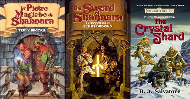
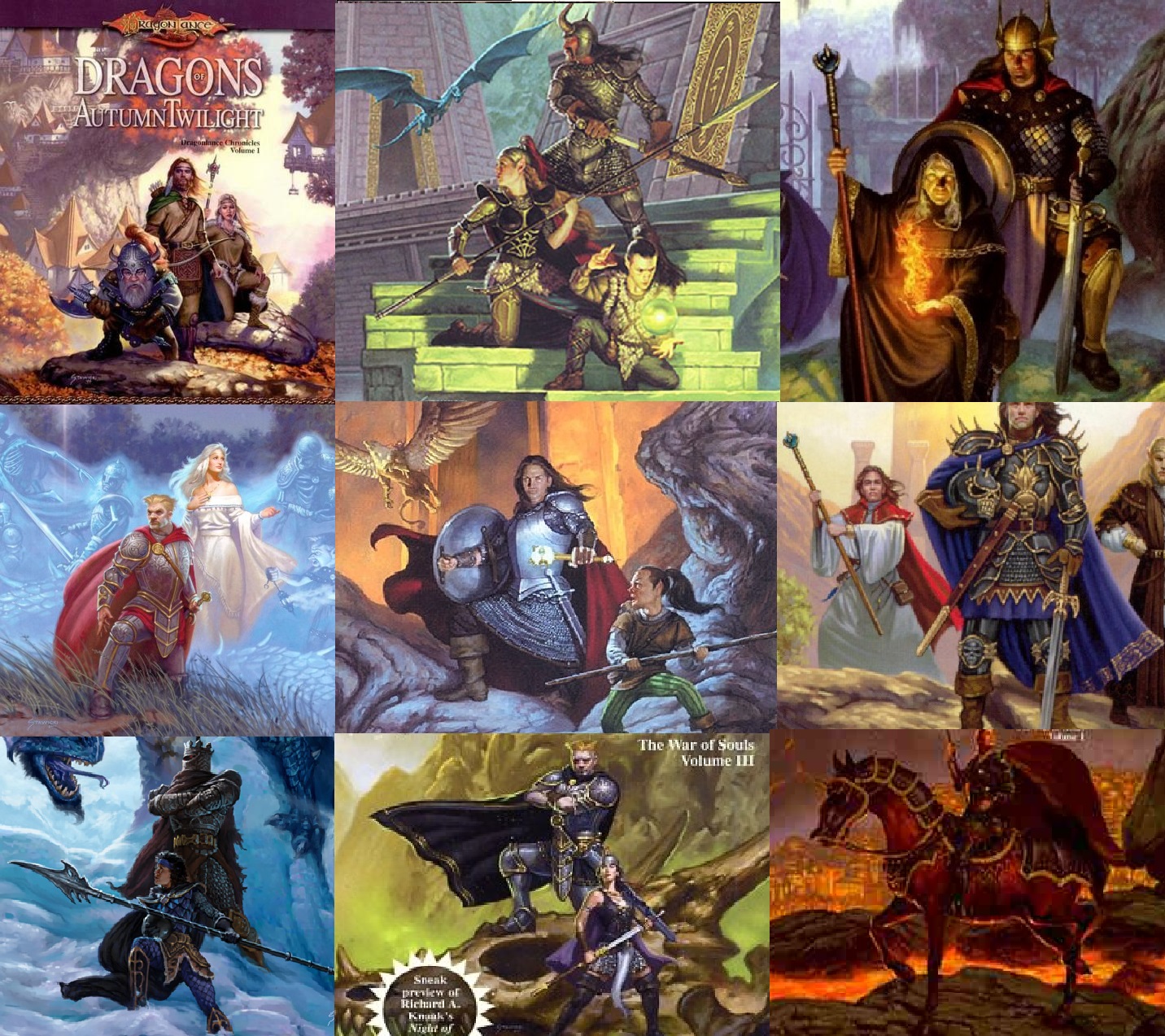
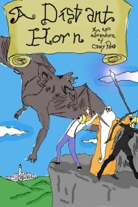
THE SIMILARITIES BETWEEN THE SWORD OF SHANNARA AND THE LORD OF THE RINGS

Names Featured In The Sword of Shannara:

Durin – In Sword, it is the name of one of the Elf brothers. In Tolkien’s works, Durin is the name of the one of the most prominent Dwarves in Middle-Earth history. Dwarves are often even referred to as Durin’s Folk. It is surmised that Tolkien got this name from an Old Norse poem. It is unknown if Terry Brooks received the name from Tolkien directly, or an older source.
Balinor – In Sword, Balinor is the prince of Tyrsis and an all-around good adventurer. This name could be a mix of two elements from Tolkien’s work: Balin is one of the thirteen Dwarves in The Hobbit, and Valinor is an Elven home from the early ages of the mythology. It could be figured that Terry Brooks mixed these two together.
Ohmsford – Not sure if this is a stretch or not, but I think it should be noted that the last name of the main character, Shea Ohmsford (the Frodo surrogate of this tale) includes the letters F-R-O-D-O, with an additional few letters. Not sure if this means anything, but I’d never seen it pointed out before.
Elfstone(s) – In the Shannara setting, The Elfstones are powerful talismans that the heroes use to combat evil. In Tolkien’s works, “Elfstone” is the translation of Elessar. Without getting into too many details, Elessar was both a collection of gems from Valinor, later given to Aragorn, who adopted the name. Terry Brooks’ follow-up novel to Sword was titled The Elfstones of Shannara.

Tom Shippey’s Excellent Breakdown of Shannara from his book, J.R.R. Tolkien, Author the Century

This is from page 232 of the Houghton Mifflin edition. (ISBN: 9780618257591)

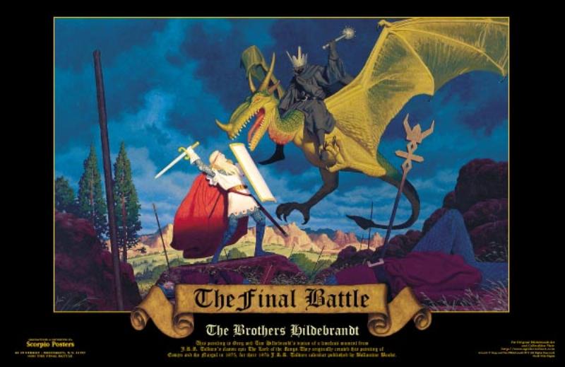
“The most obvious example is Terry Brooks’s generally derided, but still commercially successful, The Sword of Shannara. Rumour has it that when this came out in 1977 it had been comissioned by astute editos who knew they could sell anything sufficiently Tolkienian. If so, the editors were right. The ‘Shannara’ sequence is still running twenty years later, and is up to eight volumes. Yet the strange thing about the first volume at least is the dogged way in which it follows Tolkien point for point. A group is assembled to retrieve a talisman from the power of a Dark Lord. It is ‘retrieve’, ‘not destroy’, which is one point of dissimilarity. But the group assembled matches Tolkien’s Fellowship very nearly person for person. There is a Druid, or wizard, Allanon (= Gandalf); a dwarf, Hendel (= Gimli); two youths, central characters, who take the place of the four hobbits; two elves, one more than Tolkien’s Legolas, but then one of them is called Durin, a Tolkien name; and two men, Menion and Balinor, corresponding closely (Balinor has a younger brother) to Aragorn and Boromir. Gollum is reincarnated in the person of Orl Fane, a gnome who gets possession for a time of the Sword of Shannara and tries trying to regain it. The Ringwraiths re-appear, ‘deathlike cry’ and all, as flying Skull Bearers, while the phial of Galadriel is replaced as a weapon against them by the Elfstones. As if that were not enough, the plot-outline is followed very nearly point for point as well: first journey to a ‘homely house,’ Culhaven = Rivendell; pause in a hallowed forest, Storlock = Lorien; loss of Allanon, who is dragged into a fiery pit by a Skull Bearer, just like the Bridge of Khazad-Dum (though like Gandalf he reappears); and even, ambitiously though on a very small scale, the separation of the company when the hobbit-analogues are captured and led away by orc-analogues, only to be reunited later *after the expected tracking scene). There are analogues to Sauron, Denethor, Wormtongue. The hobbit-analogues are attacked by ‘Mist Wraiths’ (like the barrow-wight), a tentacled creature in a pool (like the Watcher by Moria-gate), by a malevolent tree (Willow-man). Individual scenes are closely imitated, like the slamming down of the stone door at the end of The Two Towers, and the death and withering of Saruman, or the arrival of the Riders of Rohan on the Pelennor Fields. The similarity is so close that ibn a way it is hard to tell how good or bad the result is. Anyone who had not read The Lord of the Rings might find it highly innovative – but I doubt that many of its original readers fell into that category. What the Sword of Shannara seems to show is that many readers had developed a taste (the addiction) for heroic fantasy so strongly that if they could not get the real thing, they would would take any substitution, no matter how diluted.”

DEFINITIVE LINGUISTIC PROOF THAT RIVENDELL IS SWITZERLAND?

Mae govannen, mellon!

So, earlier this morning I was working on some writing/world-building and was doing some research on snowy mountain villages. I had remembered some shots of the Swiss Alpine village from the 1969 James Bond film On Her Majesty’s Secret Service, and thought I’d find out where the movie was filmed. Such googling brought me to learn that the evil-guy base in that film lies on the top of the Schilthorn, which overlooks the Lauterbrunnen valley and its collection of villages.

I had recognized this name and the image of the valley from earlier searches about the origins of Tolkien’s works. It has long been posited that Lauterbrunnen, Switzerland was the inspiration for Rivendell in Middle-Earth. He had traveled there in 1911, and wrote years later in a letter to his son Michael:

“I am… delighted that you have made the acquaintance of Switzerland, and of the very part that I once knew best and which had the deepest effect on me. The hobbit’s journey from Rivendell to the other side of the Misty Mountains, including the glissade down the slithering stones into the pine woods, is based on my adventures in 1911… Our wanderings mainly on foot in a party of 12 are not now clear in sequence, but leave many vivid pictures as clear as yesterday.”

To further drive this home, here is Tolkein’s rendition of Rivendell next to an image of Lauterbrunnen:

But just in case we needed more proof, I have some linguistics to back up this claim!

Lauterbrunnen is made up of two German words. “Laut”, which means “loud” and “brunnen”, which means “fountain”, “well”, or “spring”. So Lauterbrunnen means “loud-fountain”, “loud-well”, or “loud-spring”. I couldn’t help but notice that “brunnen” sounded an awful lot like “Bruinen”, the river that hugs right up close to Rivendell in Middle-Earth. It is in fact the fords of the River Bruinen where the Black Riders are washed away by those horse-shaped rushes of water.

As depicted here on a few paperback versions of FOTR

Going deeper, I couldn’t help but wonder what “Bruinen” meant in Tolkien’s works. Surely, it would have some sort of translation from one of his languages. After some research and reviewing the text, whattya know, “Bruinen” it means “Loudwater”. Extremely similar to the translation for “Lauterbrunnen.” What a linguistic homage!

Doing a Control+F of “Loudwater” on the text of The Fellowship of the Ring shows that it is mentioned five times in the text. Here is the clearest indication they are the same river:

“What is that other river we can see far away there?’ asked Merry.

”That is Loudwater, the Bruinen of Rivendell,” answered Strider. “The Road runs along the edge of the hills for many miles from the Bridge to the Ford of Bruinen. But I have not yet thought how we shall cross that water.”

“Nen” can be found in other water-based Middle-Earth locations, like the lakes Nen Hithoel and Sea of Núrnen? As to whether this “nen” meaning “water” came first, and it was a happy coincidence that “Brunnen” had “nen” in there already, or if that came first and Tolkien decided to use “nen” for multiple water locations, who can say? Maybe a Tolkien linguist could help me out here!

Either way, couldn’t ignore this little linguistic homage and thought I would share. Happy reading!

So, I Was Messing Around With Book Cover Ideas. . .

Hello there, everyone. I’m back with a quasi-update about how things are going with my debut novel, y’know, editing and all that. Last year, I wrote about the trials of editing, and this year, I’ll have even more editing to talk (complain) about. In fact, I just posted something about how I was exited to jump into the next draft and how it (hopefully) won’t take as long. (Seriously, I hope it won’t take as long. But who am I kidding, really?)

Filled with the giddy excitement that this thing might actually be done soon, I was brainstorming about the cover. They tell people not to judge a book by its cover, but people TOTALLY DO. I mean, I do it. We all do it. There’s nothing wrong with that, either. In the past, I never really thought about my posters or covers for albums and stuff, but recently noticed that the projects with better covers went more places than those projects whose covers sucked. So really, your cover, which is really like a poster for your book/cd, etc, is HELLA IMPORTANT.

As with anything, I first try to think about what I like. So, what covers do I like of fantasy books? I don’t know why, but I’m more into the retro/adventure type covers. It might be because this is the first epic fantasy book I ever read, but the original cover for the The Elfstones of Shannara is awesome. And so is the one for The Sword of Shannara. Just three people on the front during some cool scene of the book. They even did this for the original cover of The Crystal Shard. Take a look:

covers_theee_people standing
I like that old-school text, too.

They also did this for some of Tracy Hickman and Margaret Weis’ Dragonlance: Chronicles books, but for these, instead of looking heroic, the people were just STANDING THERE. They’re not even adventuring. They’re literally just posing for a picture. That’s great (and kinda hilarious).

covers_Dragonlance_retro
Fine Christmas card photos.

Modern covers are all right, although the trend right now seems to be just like one person in the center, with a weapon, or a hood, turned away from us or toward us. Modern covers of Dragonlance are more or less the same, except now urr’body’s GOT THEIR KNEES BENT:

covers_Dragonlance_KNEESjpg
See? Even the horse is doing it.

Why is that? Something about having your knee up that evokes power or strength? Or do they just really love Captain Morgan? I’m going with the latter theory.

Going back to retro designs, take a look at these old Redwall covers, which are BADASS. In all honesty, has there ever been a bad Redwall cover? They are all so cool. Of course, I could spend an entire blog post just going over the Redwall covers, so I’ll restrain myself. But really:

Redwall_covers
Look at how cool these are!

So, all right, we’ve gone over what I like, but what does this mean for the cover of my book? I’ve said in previous posts that I was going to self-publish this thing, and in doing so, would need a badass cover to break out of the trend of self-pub books having ABSOLUTELY TERRIBLE covers. But before I think too hard about a cover for a self-pub, I’m also thinking of trying to get a small press to pick this up. In that case, I don’t really have much choice (I think), but we’ll see. (I’m back and forth on this, I’ll probably write something on this in the future).

So what should the cover of my book be? To give you a little taste of what the book is, it’s heroic fantasy that is both whimsical and adult. Think The Princess Bride or The Hitchhiker’s Guide to the Galaxy with a bit more curse words. It’s intended to be read like a fairy tale, with silly, magical creatures and high points of adventure! It’ll have those flowery block letters to start off chapters and etc, etc, etc. So what kind of cover would this book need?

It would no doubt be fun to do something that calls back to those old times, but, unfortunately, I need a cover that will both POP AND SELL. No one’s going to appreciate your homage-cover if the only person getting the joke is you, y’know? Since my book is adventure comedy, I might be able to lampoon any style I want, modern or old. But will a girl in a t-shirt with a goofy wizard and either a knight or archer standing there be enough to get people to check it out? Or should they be staring at something off-screen, with bent knees and swords at the ready? Or should they be like Drizzt do’Urden and be fighting on the cover?

Covers_drizztfighting
Seriously, this guy fights a lot.

I’ve thought about it this a bunch, and while I go back and forth about it, this hasn’t stopped me from doodling out concepts. There’s just so many ways to go, and in my never-ending pursuit to be a masochist and TRY EVERY AVENUE EVER, I GIMP’ed this little proof of concept picture, which is a hack-job from at least six different sources:

ADH_COVER_Messing_JPEG

The sky, ground, and rock are random Google searches. The city back there is made from a picture of Oia, Greece and a clock tower from some other city. The girl in front is from a Hildebrandt Brothers’ painting of Eowyn and the Witch-king. The bald part of the wizard’s head is Bruce Willis’ head, and so on.

And sure, this does look interesting, and DOES kind of look like a fantasy cover. And since I apparently had nothing to do the other today, I spent a bunch of hours drawing over it and creating this. Another proof-of-concept test, trying to turn it into something a little more comedic/funny:

ADH_COVER_DOOLE_with_outline
The rock looks pretty great. . .

Of course, the scary creature looks absolutely not scary and some of the drawing is off. That’s all right, this was just a test. I have a dude who I’ve contacted about the art who is way better than me and might be able to make something like this really stand out.

But be honest book fans, would this cover be interesting to you? If it were drawn a little more cartoony and better?

I understand that book covers should do a couple things. Explain your whole novel in one image. In essence, it’s about a group of heroes trying to get to a city, but they’re being stopped by deadly shit on the way. (But does the cover convey they’re trying to GET to the city? Maybe a road leading to it would help?) Does it say anything about the characters? Hmm…their facial expressions could probably say more. Does the city in the back at peak interest? I noticed that almost every cover of “The Wizard of Oz” has the Emerald City in the background, because it’s so damn important. Not to say that my book is like “The Wizard of Oz”, but. . .holy shit, guys, it might be just a little bit. O___O

So what do you think? Please once again note that this is a ROUGH DRAFT and not the final thing, but is this design interesting? What would you like to see in a book cover for a story like this? What do you like on book covers in general?

If all else fails, I’ll just have them all bend their knees.

Stay tuned for more updates!

-Casey

Follow me on Twitter for more goodies!

OTHER GREAT LINKS TO THIS TOPIC:

Debut Novel Editing Update: January 25, 2014 (01.25.2014)
“A Distant Horn” Novel Editing Update: September 26, 2013 (09.26.2013)
“A Distant Horn” Novel Editing Update: July 20, 2013 (07.21.2013)
“A Distant Horn” Update: May 9, 2013 (03.09.2013)

Debut Novel Editing Update – January 25, 2014

*written very late, posted later during regular human hours*

Hey there everyone, how are you all doing? I was just laying in bed, yawning my ass off and flipping through a draft of my debut novel when the genius idea to write a novel editing update came to me. Inspiration sure does have a way of calling upon you whenever it likes, even if you’re comfortably snuggled under some heavy blankets and feeling just fine. Anyway, I’ll make this quick so I can get back to said bed and finally get some shut-eye.

So, updates, all right. I have to say I’m a little embarrassed to be coming here, especially since I announced so grandly that I would release this book November 1 of last year. And, well, that didn’t happen. So I guess I’m here to tell you that there is a new release date, but I have no idea when that will be. I’m guessing sometime before 2099. Perhaps I will, I don’t know, FINISH IT COMPLETELY before I go off spouting when it will come out, because, with leading such a busy life full of projects, I cannot properly forecast any releases.

What I DO know, however, is that I am just about ready to go in for the third pass. I wrote this beast way back in 2010, and then last year, I read it, then probably read it again, the WENT THROUGH THE WHOLE THING and changed a bunch, read it again, and then again, and, seriously, AGAIN. After so much reading and editing, I was quite honestly knackered and couldn’t come back to it. I’ve explained before that how unanticipated the amount of work was, sending me through the editorial wringer. Editing this book is probably more epic of an undertaking than my characters’ crazy adventure. I’d take a quest through dangerous territory any day. At least then I’d be outside, instead of holed up in the corner, fearing for life from the huge stacks of papers around me.

Update_pic_1
I knew I shoulda gone paperless!

So as I said, I’ve had my space and am ready to come back (seriously, book, you were smothering me!), and this time, which a BUNCH of notes. In my mess of files, there is one that has EIGHTEEN notes about what needs to be changed or altered. Some things need to be reiterated a little bit. One minor character has to have her personality completely changed (which will, of course, alter fucking EVERYTHING). Another little scene has to be added that will serve multiple purposes. (I’ll tell you now that all those new scenes I wrote for the second draft I’m going to cut out again, which is fucking GREAT). One scene will be glossed over, and so on. It’s going to be a lot of work, but maybe not as much to freaking kill me like last time.

What’s good is that I finally, FINALLY, found out a way to rid of the tonal problems in the middle. (Remember the tonal graph I made?) So yay for that! Just took a year of hard thinking. Funny thing is, the solution to the problem came about when I was spacing out at my old market job. But really, once those tonal issues are fixed, this thing’ll be tonally consistent, which means that I will finally have the confidence to hand it off to some beta readers and see what they think!

Update_pic_2
Confirmed to be one of my betas.

Anyway, it’s very exciting to have everything kind of falling into place. Sometimes I feel stories are like gears, or, like, multiple thingies that have those gear-like teeth (this is the sleep deprivation talking). And for whatever reason, the teeth won’t fit together and they don’t lock. But then, after a while, they DO lock, and perhaps you didn’t know what you were exactly looking for but when you see it you recognize it. And I always had reservations about that middle part. In every single draft, even when my friends who’d read it already said it wasn’t a big deal, that middle part had always bugged me. It just didn’t MESH with the rest of it, y’know? BUT NOW IT DOES, BAY-BEE, and once that’s done, then I can give it off and then get it one step closer to getting it to ALL OF YOU GALS AND GUYS, which is, really, the most exciting part. (And the scariest, too).

Of course, there’s the whole “self-publish” or “small press” discussion in my mind, too, but that is really a whole blog post in itself. So more on that later maybe.

I guess all I wanted to say is that I am getting closer and closer to making this thing as best as it can be. Making it its purest self that it can be. And that I’m excited to get it all out to you sometime. If not later this year, then the next year, but hopefully no longer than that (seriously, the book ITSELF seems excited to get out there!)

But for now, sleepy time. Maybe I’ll work on it tomorrow. Or just nap. Yeah, a nap sounds better. Better books are written when you’re sleeping, right?

Until next time,

-Casey

Update_pic_3

Follow me on Twitter for more goodies!

OTHER GREAT LINKS RELATED TO THIS TOPIC:

“A Distant Horn” Novel Editing Update: September 26, 2013 (09.26.2013)
“A Distant Horn” Novel Editing Update: July 20, 2013 (07.21.2013)
“A Distant Horn” Update: May 9, 2013 (03.09.2013)

“Dragonworld” by Byron Preiss and Michael Reaves Book Review

Photobucket
LAME

***Originally posted on my old blog on October 25, 2009***

While at a thrift store one Saturday with a friend of mine, I perused the book section to see what they had in stock. I was somewhat surprised to find that they had no interesting books, since there is usually a gem or two in the unorganized shelving and random piling. Unfortunately I found no gems, but picked up two cheap-ass books. One was a “Norwegian in ten minutes a day” which is totally fucking hard as shit, and the other is a 1979 fantasy book that is nearly falling apart called “Dragonworld.”

I don’t know if I hate all fantasy, or just old fantasy (a time when everyone ripped off Tolkien and pretended like no one would notice). Normally I wouldn’t have picked up and old, yellow-paged fantasy book, but this one had pictures! I know you’re probably rolling your eyes and thinking in a dumb cave-man voice “Wow, he only got it because it had pictures,” but I like fucking pictures in fantasy books so fuck you.

Well, I went out on a limb and paid the twenty-four cents (yes, I got this book for less than a quarter) and bought it. I began to read it in the following days, and within a week, I found myself walking to school, flipping through the pages to find the next picture. This book isn’t boring, per se, but, wait, what the fuck am I saying? It is completely boring.

The story starts off with some dumbass kid flying around on some wing contraption. When the kid sees a dragon and gets killed by it (or just crashes and burns and dies), his father Jondalrun (this ugly-ass old dude) is fucking pissed. He blames Amsel, this Da-Vinci-like maker of irrelevant tools and other knick-knackery for his son’s death, for it was Amsel’s flying machine that the fucking kid stole. A Council of Elders is called to talk about the mysterious death, because Jondalrun also accuses the Simbalese (the mysterious folk to the East) of killing his son. He’s kind of a crazy bastard, but whatever. Judging from the rest of the pictures, Amsel flees and ends up in Simbala, meeting a princess and a hero and a whatever the fuck and going on adventures with dragons and all that shit.

The story seems alright enough, except for the fact that I don’t give a fuck at all about who dies or not, but it’s the description that really bogs down the story. Like with many fantasy books, this one tries to build the world within the damn book. Instead of having us learn about how the Council of Elders works during the scene itself, they give us a fucking history lesson about how it was founded, where it first took place, and all this other bullshit that is absolutely not important. Seriously. . .I DON’T NEED ALL THIS FUCKING DESCRIPTION! I don’t give a shit about what this town looks like, because I’m pretty damn sure it looks just like a medieval town. If there’s a fucking skyscraper in the town, tell me, but otherwise, just STFU.

So, in conclusion, this book is lame. It has a sequel, but it can only be read on old-ass computers. Apparently the sequel is a “choose your own adventure” type book that you read on your computer. It has “over 60 magnificent microcomputer graphics,” and will be released in the summer of 1984. . . jesus this book is old.

Although I only paid 24 cents for it. . .I still feel a little ripped off. . . I mean. . .I paid 24 CENTS for it. . . fuck. . .it kinda smells funny too. . .