Hello there, everyone. I’m back with a quasi-update about how things are going with my debut novel, y’know, editing and all that. Last year, I wrote about the trials of editing, and this year, I’ll have even more editing to talk (complain) about. In fact, I just posted something about how I was exited to jump into the next draft and how it (hopefully) won’t take as long. (Seriously, I hope it won’t take as long. But who am I kidding, really?)
Filled with the giddy excitement that this thing might actually be done soon, I was brainstorming about the cover. They tell people not to judge a book by its cover, but people TOTALLY DO. I mean, I do it. We all do it. There’s nothing wrong with that, either. In the past, I never really thought about my posters or covers for albums and stuff, but recently noticed that the projects with better covers went more places than those projects whose covers sucked. So really, your cover, which is really like a poster for your book/cd, etc, is HELLA IMPORTANT.
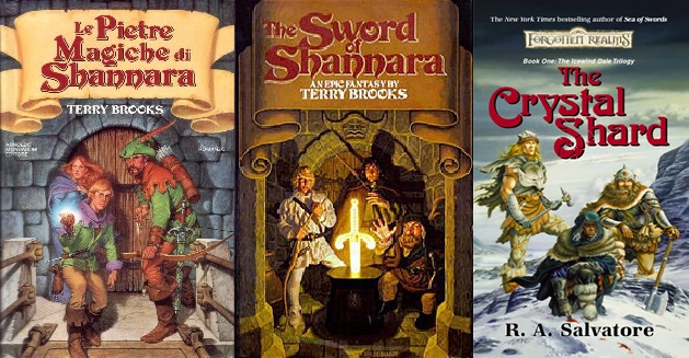
As with anything, I first try to think about what I like. So, what covers do I like of fantasy books? I don’t know why, but I’m more into the retro/adventure type covers. It might be because this is the first epic fantasy book I ever read, but the original cover for the The Elfstones of Shannara is awesome. And so is the one for The Sword of Shannara. Just three people on the front during some cool scene of the book. They even did this for the original cover of The Crystal Shard. Take a look:
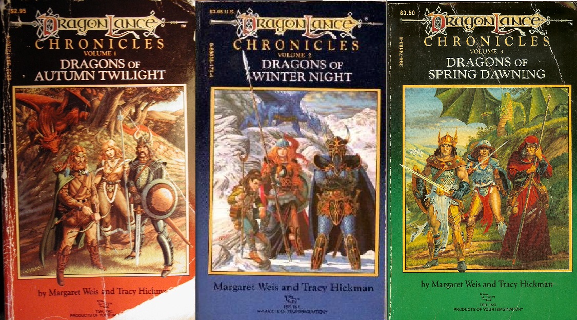
They also did this for some of Tracy Hickman and Margaret Weis’ Dragonlance: Chronicles books, but for these, instead of looking heroic, the people were just STANDING THERE. They’re not even adventuring. They’re literally just posing for a picture. That’s great (and kinda hilarious).
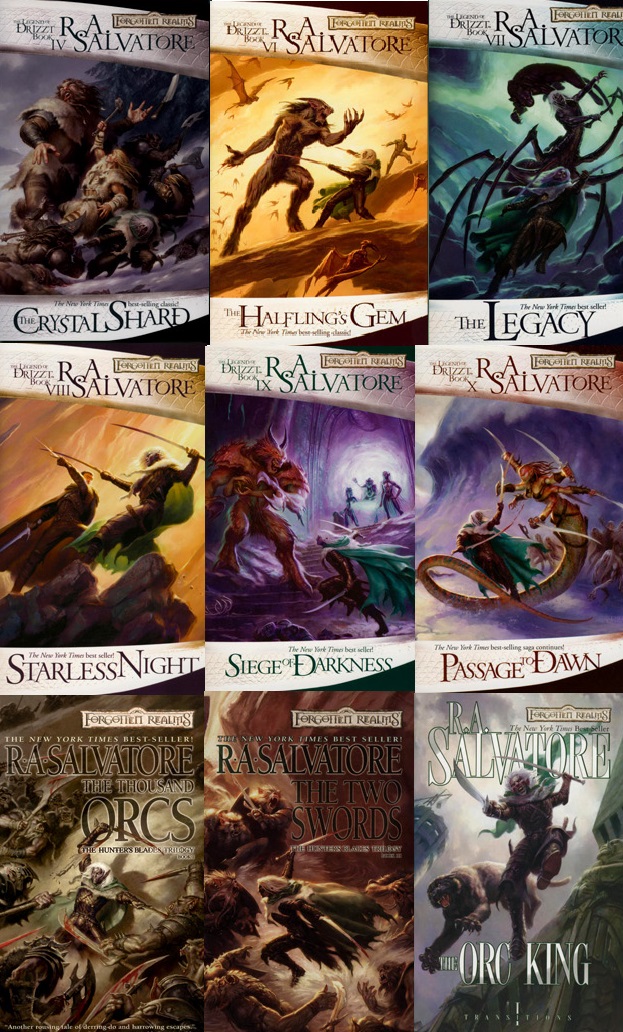
Modern covers are all right, although the trend right now seems to be just like one person in the center, with a weapon, or a hood, turned away from us or toward us. Modern covers of Dragonlance are more or less the same, except now urr’body’s GOT THEIR KNEES BENT:
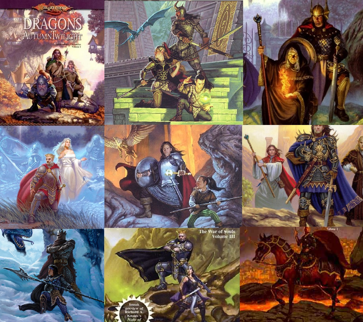
Why is that? Something about having your knee up that evokes power or strength? Or do they just really love Captain Morgan? I’m going with the latter theory.
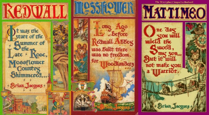
Going back to retro designs, take a look at these old Redwall covers, which are BADASS. In all honesty, has there ever been a bad Redwall cover? They are all so cool. Of course, I could spend an entire blog post just going over the Redwall covers, so I’ll restrain myself. But really:
So, all right, we’ve gone over what I like, but what does this mean for the cover of my book? I’ve said in previous posts that I was going to self-publish this thing, and in doing so, would need a badass cover to break out of the trend of self-pub books having ABSOLUTELY TERRIBLE covers. But before I think too hard about a cover for a self-pub, I’m also thinking of trying to get a small press to pick this up. In that case, I don’t really have much choice (I think), but we’ll see. (I’m back and forth on this, I’ll probably write something on this in the future).
So what should the cover of my book be? To give you a little taste of what the book is, it’s heroic fantasy that is both whimsical and adult. Think The Princess Bride or The Hitchhiker’s Guide to the Galaxy with a bit more curse words. It’s intended to be read like a fairy tale, with silly, magical creatures and high points of adventure! It’ll have those flowery block letters to start off chapters and etc, etc, etc. So what kind of cover would this book need?
It would no doubt be fun to do something that calls back to those old times, but, unfortunately, I need a cover that will both POP AND SELL. No one’s going to appreciate your homage-cover if the only person getting the joke is you, y’know? Since my book is adventure comedy, I might be able to lampoon any style I want, modern or old. But will a girl in a t-shirt with a goofy wizard and either a knight or archer standing there be enough to get people to check it out? Or should they be staring at something off-screen, with bent knees and swords at the ready? Or should they be like Drizzt do’Urden and be fighting on the cover?
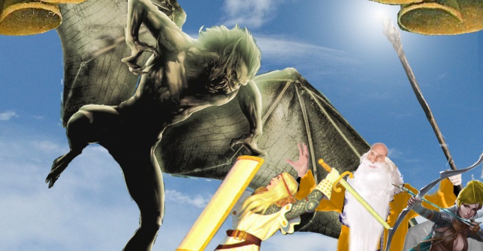
I’ve thought about it this a bunch, and while I go back and forth about it, this hasn’t stopped me from doodling out concepts. There’s just so many ways to go, and in my never-ending pursuit to be a masochist and TRY EVERY AVENUE EVER, I GIMP’ed this little proof of concept picture, which is a hack-job from at least six different sources:
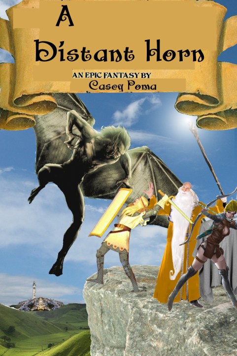
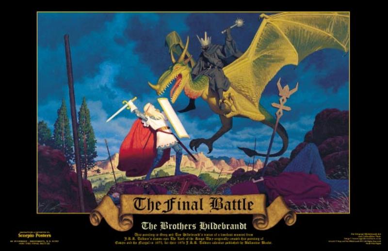
The sky, ground, and rock are random Google searches. The city back there is made from a picture of Oia, Greece and a clock tower from some other city. The girl in front is from a Hildebrandt Brothers’ painting of Eowyn and the Witch-king. The bald part of the wizard’s head is Bruce Willis’ head, and so on.
And sure, this does look interesting, and DOES kind of look like a fantasy cover. And since I apparently had nothing to do the other today, I spent a bunch of hours drawing over it and creating this. Another proof-of-concept test, trying to turn it into something a little more comedic/funny:

Of course, the scary creature looks absolutely not scary and some of the drawing is off. That’s all right, this was just a test. I have a dude who I’ve contacted about the art who is way better than me and might be able to make something like this really stand out.
But be honest book fans, would this cover be interesting to you? If it were drawn a little more cartoony and better?
I understand that book covers should do a couple things. Explain your whole novel in one image. In essence, it’s about a group of heroes trying to get to a city, but they’re being stopped by deadly shit on the way. (But does the cover convey they’re trying to GET to the city? Maybe a road leading to it would help?) Does it say anything about the characters? Hmm…their facial expressions could probably say more. Does the city in the back at peak interest? I noticed that almost every cover of “The Wizard of Oz” has the Emerald City in the background, because it’s so damn important. Not to say that my book is like “The Wizard of Oz”, but. . .holy shit, guys, it might be just a little bit. O___O
So what do you think? Please once again note that this is a ROUGH DRAFT and not the final thing, but is this design interesting? What would you like to see in a book cover for a story like this? What do you like on book covers in general?
If all else fails, I’ll just have them all bend their knees.
Stay tuned for more updates!
-Casey
Follow me on Twitter for more goodies!
OTHER GREAT LINKS TO THIS TOPIC:
Debut Novel Editing Update: January 25, 2014 (01.25.2014)
“A Distant Horn” Novel Editing Update: September 26, 2013 (09.26.2013)
“A Distant Horn” Novel Editing Update: July 20, 2013 (07.21.2013)
“A Distant Horn” Update: May 9, 2013 (03.09.2013)
